With lively photographs, info graphics and straightforward design, this annual report simply reflects the character of the company.
Client : Charoen Pokphand Foods
Year : 2015

With lively photographs, info graphics and straightforward design, this annual report simply reflects the character of the company.
Client : Charoen Pokphand Foods
Year : 2015

Art direction and design for a unique guidebook written by a lifestyle guru of Thailand. We drew an inspiration from the ordinary objects in Hong Kong i.e. colours, motifs, etc. to portray the unique character of Hong Kong.
Client : Talent 1
Year : 2015
To celebrate the 50th anniversary of Chevron in Thailand, Chevron’s aim is to make a better living for Thai people in multiple dimensions such as energy security, education, environment etc. We used the stories and portrait of company’s stakeholders to reflect the 30 years of commitment.
Client : Chevron
Year : 2012
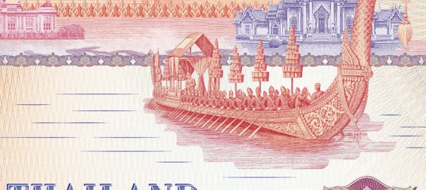
To promote AEC 2015, as known as ASEAN Economic Community 2015, the calendar serves as an introduction to AEC member countries. The distinctive landmark illustrations were inspired by the banknote style engraving helping reflect the business of the bank.
Client : Bangkok Bank
Year : 2014
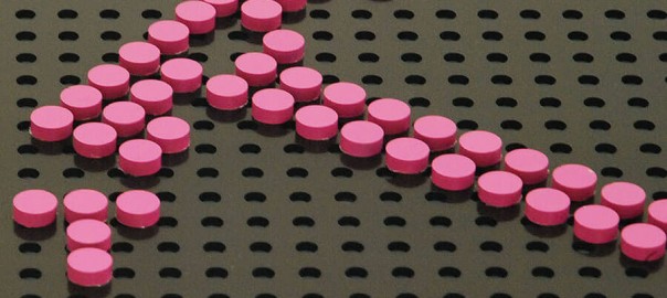
We designed the signage system for a hardware store called DIY Shop with the concept of D.I.Y. The icons on the signage, made from wooden pins are changeable and colour coded to indicate the category of the products.
Client : Boonthavorn
Year : 2010

Beehive Buns Bakery considers itself a premium homemade bakery brand that uses only the finest ingredients. We were asked to develop the brand identity, brochure, uniform and a series of product packaging. For its visual identity, we combined the ‘B’ and bee shape, as well as used bright yellow colour to project the liveliness of the brand.
Client : Beehive Buns Bakery
Year : 2015
